Finally after finishing all the performance pieces of the video it was time to start adding the animatics which is something we had all been anticipating.
For example one of the things we added animatics to, was the first shot of our video. In which the girls were in the background and in the foreground was the boombox, from which we animated the words 'heyyyy yeahhhhh, i wanna shoop baby' coming out of it. Then we added a few more to other shots.
We had the same font and colour for all of the animations, the font being Diego con and the text being block white. However they can in at different angles and what not. We chose to put around 7 animations into the video, all on different shots to help create an emphasis. But on the one with the phone number popping out, we are unsure of it and aren't sure it works very well.
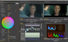
Then we went onto colour grading, which we are using in order to even out the colours and help again give our video a more of a retro feel. However this was a hard job as much of the lighting was different so it was hard to get all of the colours the same.
Overall its been a very busy morning which has taken up a lot of time, as we also had to make the green screen perfect, with an appropriate background which fits the theme and had to change the white and black balance to avoid any shimmering outlines.